⚠️ Effective March 26, 2026
All new forms must be created using the Form Module.
Form elements are the Input values, or questions, on your form. Form elements can be added, configured, and deleted to create custom forms that website visitors can complete. The results are saved to KaratEmail.
- Please see Creating a Form for instructions on creating the form asset itself.
- Please see Form Elements, Attributes Reference for more detailed explanations of the attributes mentioned briefly below.
Six primary elements are available to add to any form and each has a unique functionality. These elements are explained on this page:
- Single-Line Text Field
- Multi-Line Text Field
- Radio Buttons
- Checkboxes
- Drop-Down
- Multi-Select
Adding form elements to an asset is accomplished either by dragging the element onto the Elements panel from the Elements toolbar, or by clicking the element's name or plus sign. Once the element has been added to the Elements panel, the text details can be added and it can be reordered by dragging it to the new location and dropping it into place.
Your form elements will appear on the form arranged in the order you add them to the Form Asset, displaying with the Label name and input field.
While creating the Form Asset

Once the Asset is created
By default, your form elements will appear as a list. However, you can group your items and include headings. For example, you may wish to label the first set of questions "Basic Information" and the next set of questions "Location Information."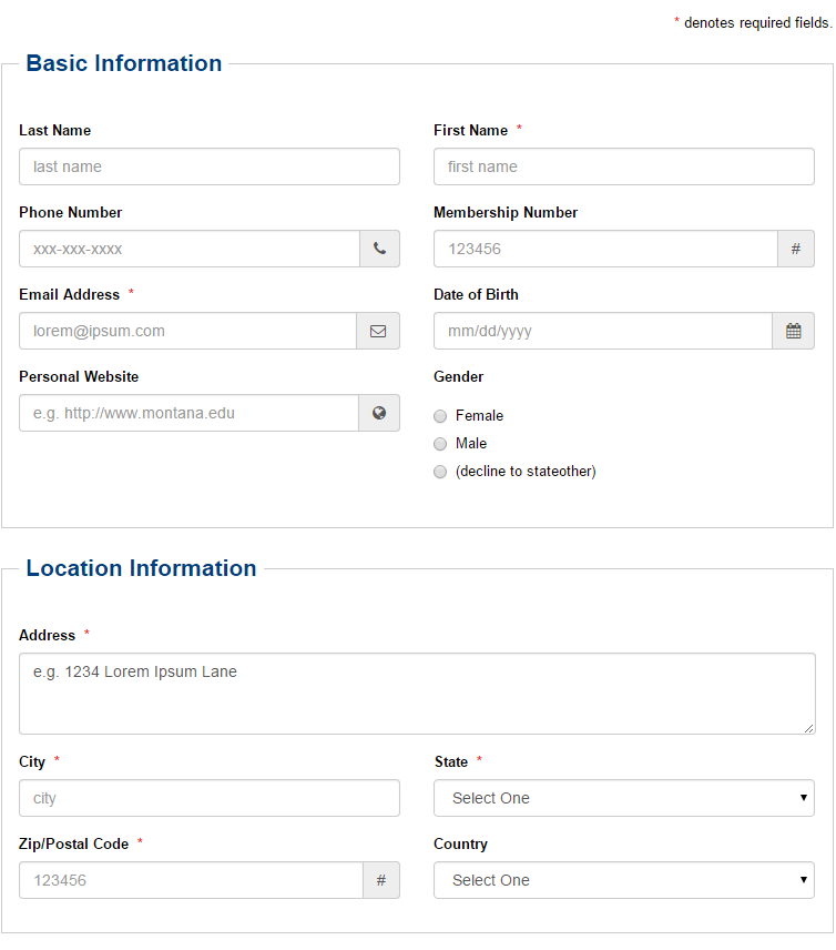
To create custom labels please visit Form Elements Advanced Field.
Once your form has been added to a web page the form dashboard will be made available for connecting users, managing form submissions, editing the form, and asking for help. Please see Form Dashboard for more information on this topic.
Single-Line Text Field
A single-line, text-field element provides users with one line on which to input data. Additionally, it can be used with the Advanced field attributes to create specific elements.
How it appears when creating the form:
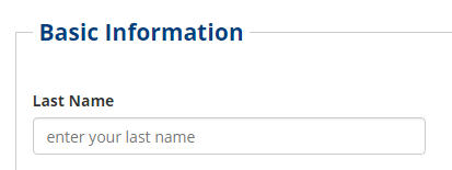
The fieldset attributes can be used to create a frame for the section and a legend, in order to set it off from other form elements.
Custom Types
The Single-Line Text field can also be used to create inputs of the following type through the use of the Advanced custom-type option. These options are described in more detail in Custom Input Types.
- Date Range
- Date
- Telephone Number
- Fax Number
- URL
- Email Address
- Hexadecimal Color
- Time of Day
- United States Zip Code
Custom Type Groups
The Single-Line Text field can also be used to create input groups of the following type through the use of the Advanced custom-type-group option. These options are described in more detail in Custom Type Groups.
- Address
- Signature
Multi-Line Text Field
A multi-line text field element provides users with a multi-line text field in which to input data. Similar to the single-line text field element except that the input field can take more input and can be configured to appear larger. This is done with the use of the cols and add-class attribute in the Advanced field.
Checking 'Required' or specifying required=true; in the Advanced field will make the element required.
How it appears when creating the form:
Custom Types
The Multi-Line Text field can also be used to create inputs of the following type through the use of the Advanced custom-type option. These options are described in more detail in Custom Input Types.
Radio Buttons
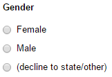
Radio button elements allow users to create a form element with multiple, predefined items of which one and only one can be selected by the user. Click the Add button next to Items in order to add a radio button with text.
The Advanced field, dataset, add-class, and the fieldset attributes can be used with radio buttons.
Checkboxes
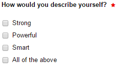
The Checkboxes element can be used to create a form element with multiple, predefined items of which one, none, or more than one can be selected by the user. Click the Add button next to Items in order to add each checkbox and define the text. Preselecting one or more checkbox items when creating or editing the form will preselect the items on the published page also.
The Advanced field, dataset, add-class, and the fieldset attributes can be used with radio buttons.
Drop-Down
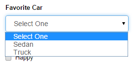
Drop-down form elements provide users with the ability to select an item from a list of pre-defined options using a drop-down style menu. Click the Add button to add each item.
The Advanced field, dataset, add-class, and the fieldset attributes can be used with radio buttons.
Custom Types
The Drop-Down field can also be used to create inputs of the following type through the use of the Advanced custom-type option. These options are described in more detail in Custom Input Types.
- Combobox
Multi-Select
The Multi-Select form element includes the ability to select multiple items using the keyboard shortcut CTRL + click [PC]. The Multi-Select example provided shows the use of a predefined dataset called state and that is defined in an XSL. It provides a list of states of which many can be selected.
The Advanced field, dataset, add-class, and the fieldset attributes can be used with radio buttons.
