⚠️ Effective March 26, 2026
All new forms must be created using the Form Module.
Several of the attributes used for the form elements have the same functionality no matter which element it is used within. The attributes defined with the form create the nodes in the XML and define what is presented to the user on the form.
The system removes the following five characters from the radio button, checkboxes, drop-down, and multi-select element entries when saving:
[ ] ‘ / \ Other characters such as the @ sign are allowed.
If the disallowed values are inserted into one of the elements, then it will not appear in the form, in the published form, or in the data that are returned.
Label and Name
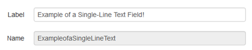
Available and required for all elements.
By default, the Name field is populated by the value defined by the user in the Label field when adding the element to the form. However, the value of the Name field can be edited by the user, but only at the time of creating the element (before saving the form).
The Name field is limited to 32 characters and can include alpha-numeric characters, but cannot contain spaces or other ASCII characters. The value that is entered in the Label field is truncated within the Name field if it exceeds the 32 character limit and other disallowed characters are automatically removed. The Label itself can include more than 2,000 characters.
The Name entry is automatically truncated by the system and the form data will break if any two elements have an identical name. Note that two elements can have different labels, but the name will get truncated to create the same value.
For example, when entering the following as two unique labels, the Name field gets populated with the same data and breaks the form:
- Are any of the following sponsoring organizations for the Project's First Author? (Choose all that apply)
- Are any of the following sponsoring organizations for the Project's Second Author? (Choose all that apply)
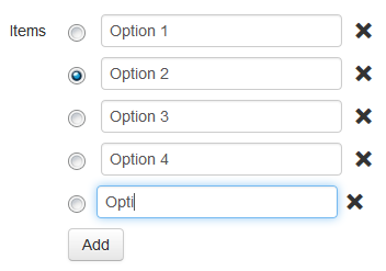
Items
Available for radio buttons, checkboxes, drop-downs, and multi-select elements. Click the Add button to add the option items as necessary. For each element, one or more items (as appropriate) can be preselected for the form. When using a predefined data set in the Advanced field, it is not necessary to add each item individually. This is particularly useful for lengthy lists.
Required and Required Failure Text
Built-in availability for single-line and multi-line elements and available via the "Advanced" field for all other input types.
Select the Required checkbox in order to compel the user to provide input for the element. The XSL applies a span with the class, required, and prepends an asterisk to the label. The styling for a required element can be modified where it is defined (CSS or XSL). Additionally, when selecting Required, the Required Failure Text field becomes available. Use this field to define the text that provides an error message for the visitor, if the field has not been completed correctly prior to submission. To instead use the standard failure text, enter 'default' into this field.


Default Text
Optional. Available for single-line and multi-line elements.
Entering a value into the Default Text is optional. If a message is entered it is shown as the initial value for the form element. The message should contain a helpful tip or example of the desired entry format.
Validation and Additional Validation Messages
Defines a validation method for the element; default is No Validation. Selecting a specific validation method also provides one or more additional fields for further refinement of the validation to be used and for providing the failure text. The failure text can be used in order to give the user a hint about what is required.
The options for the Validation field are as follows:
| Validation Type | Description |
|---|---|
| No Validation | No validation performed, no extra fields. |
| E-Mail Address | This validates the text to ensure that the entry is formatted like an email address. When this is choosen, an additional Failure Text field can be used to provide a message when the input fails validation. Makes the Failure Text field available. E-mail addresses are validated for the @ sign and dot-something. |
| Minimum Length | This allows a number to be input to ensure that a minimum number of characters are included. When this is chosen, an additional Minimum Length field is used to specify the number and the Failure Text field can be used to provide a message when the input fails validation. Makes the Minimum Length/Failure Text field available. The minimum length is entered here as a number and can be 2 or greater. |
| Regular Expression | This allows a regular expression to be input to ensure that the configuration of the input data is as desired. When this is chosen, an additional Validation Regex field is used to specify the regex and the Validation/Failure Text field can be used to provide a message when the input fails validation. For example, if the form requires the entry of the year of birth, it would be within the 1900s or 2000s. A regex that validates for this is: (19\d{2}|20[0-1]\d) Makes the Regex/Failure Text field available. |
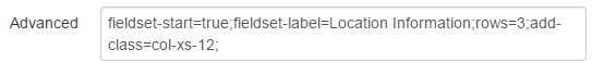
The following example shows a group of elements set off by a gray border and a title created by fieldset attributes.

This example shows the text that was defined in the Failure Text field for the Name:
Advanced
Optional, but super useful for defining and reusing frequently used data. Available for all elements, but attributes are specific to elements. The Advanced field can be used with predefined attributes. For usage, reference, and examples of attributes, see Form Elements Advanced Field.