⚠️ Effective March 26, 2026
All new forms must be created using the Form Module.
The Form UI has builtin form elements such as Drop-Downs, Text fields, etc. but by using the Advanced field option custom-type, you can extend your form to include several new types of automatically validated and formatted inputs.
- For more information about form elements, visit Creating Your Form's Elements
- For more information on the Advanced field visit Form Elements Advanced Field
Color
Syntax Example:
custom-type=color;custom-type=color;Description:
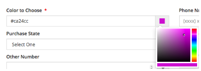
This input can be used to create a field bound by these additional Advanced field options. Users can choose a new color by clicking on the colored square to the right of the input.
| Name | Description | Example |
|---|---|---|
| color-picker-color |
Set the starting color for the input. The default is black. |
|
Here is an example with the color picker dialog:

Date & Date Range
While this is an advanced feature, you can also use the Date/Time Picker from the basic Form Elements panel. A single date picker or two date pickers paired into a date range can be created using these custom types. Additionally the following advanced option(s) may be used in conjunction with these custom types:
| Name | Description | Example |
|---|---|---|
| datepicker-start-date |
Defines the offset from today for the date picker to start enabling date choices. By default the start date is 0d or today. |
|
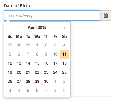
In this example, the custom-type is date with no additional Advanced options.

In this example, a custom-type of date range is specified.

Attribute Name:
date
Syntax Example:
custom-type=date;Description:
This creates an input with a date picker. While this is an advanced feature, you can also use the Date/Time Picker from the basic Form Elements panel.
Attribute Name:
daterange
Syntax Example:
custom-type=daterange;Description:
Use this custom type create two date input fields for a start and stop date. While this is an advanced feature, you can also use the Date/Time Picker from the basic Form Elements panel.
Email Address
Syntax Example:
custom-type=email;Description:
This input can be used to create a field for users to enter email addresses.
Here is an example.

Telephone and Fax Numbers
An input styled for a telephone or fax number can be created using tel or fax custom-types.
In this example, the custom-type is fax.

In this example, a custom-type of tel is specified.

Attribute Name:
tel
Syntax Example:
custom-type=tel;Description:
Use this custom type to create an input suitable for a telephone number.
Attribute Name:
fax
Syntax Example:
custom-type=fax;
Description:
Use this custom type to create an input suitable for a fax number.
Ignore
Syntax Example:
custom-type=ignore;Description:
This input can be used to pass explicit HTML into the form verbatim. The form will include any HTML specified in the 'Default' input field verbatim. This field is useful for including paragraphs, social icons, images, etc. The advanced field parameters add-class and clearfix-after can be used in tandem to control how the HTML interacts with the rest of the form HTML.
Here is a simple example.
Example from form element panel in the CMS.

Number
Syntax Example:
custom-type=number;Description:
This input can be used to create a field bound by these additional Advanced field options:
| Name | Description | Example |
|---|---|---|
| max | Set the maximum number allowed for the input. | |
| min | Set the minimum number allowed for the input. | |
| step | Set the step size for the HMTL5 up/down arrows in the input. | |
Here is a simple number example.

Time
Syntax Example:
custom-type=time;Description:
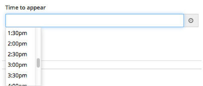
Use this custom type to provide users with a time-of-day chooser. This input can be used to create a field bound by these additional Advanced field options:
| Name | Description | Example |
|---|---|---|
| timepicker-scroll-default |
Specify whether or not to scroll the chooser to the user's current time. The default value for this is true. |
|
Here is a simple example.

URL
Syntax Example:
custom-type=url;Description:
This creates an input styled for a URL.
Here is an example.

Zipcode
Syntax Example:
custom-type=zipcodeUS;Description:
This input can be used to create a field for users to enter United States zipcodes.
Here is a simple example.
