⚠️ Effective March 26, 2026
All new forms must be created using the Form Module.
A form provides users with the tools necessary to create questionnaires, surveys, polls, and other types of forms. Users can choose from eight types of elements to insert into a form.
- Single-Line Text Field
- Multi-Line Text Field
- Radio Buttons
- Checkboxes
- Drop-Down
- Multi-Select
- Date/Time Picker
- Instructional Text
For more information about form elements, visit Creating Your Form's Elements.
Each element has the Advanced field attribute, allowing you to further customize your forms. The following information specifies ways you might use the Advanced field.
Please note:
-
Every declaration in the Advanced field must be terminated with a semicolon. For example:
rows=3;add-class=col-sm-4; - Attributes should always be lowercase and in certain cases, more than one attribute can be included in the field. For
add-class, the class has to be already defined in CSS. -
If a Required checkbox is available for a form element it will need to be selected via the interface. If a "required" checkbox is not available, it can be specified in the Advanced field with the following:
required=true;
Fieldset-*
A fieldset typically includes three items that are used to group a set of form elements:
| Name | Description | Example |
|---|---|---|
| fieldset-start | Defines the beginning of the fieldset. | |
| fieldset-label | Defines the label for the fieldset. | |
| fieldset-end | Defines the end of the fieldset. | |
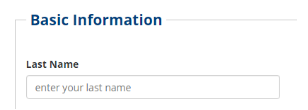
In this example, a single-line text field element is used to start a fieldset and to give it the label of Basic Information.

In this example, size of a radio button and fieldset-end=true; to close off the gray fieldset frame.
Example from form element panel in the CMS.

Add-Class
Syntax Example:
add-class=col-sm-6;Description:
The add-class attribute adds a class to the label of an element. The class can be anything that has been defined in CSS. In this example, the col-xs-12 Bootstrap class is added to the <div> containing the control and label. Upon render the input will span 100% of all available screen width instead of the default 50% (provided by the col-sm-6 default class).
HTML Output Example
<div class="form-group col-sm-6">
…
</div>
Note: Use Bootstrap classes to affect width adjustments to any input and to more closely control the layout of the form. See "Bootstrap Grid System" for more information.
Clearfix-After
Syntax Example:
clearfix-after=visible-sm-block visible-md-block visible-lg-block;Description:
The clearfix-after attribute adds a <div> beneath the input to break the responsive form grid layout of Bootstrap as described in their documentation. This attribute is extremely useful in removing odd spacing and wrapping within the form layout.
In the syntax example, the responsive grid will force a line-break for small, medium, and large screen sizes.
Cols, Rows, and Size Attributes
Note: cols is no longer in use. Use add-class and the "Bootstrap Grid System" to define the control widths.
Attribute Name:
rows
Syntax Example:
rows=10;Description:
The rows attribute adds a rows attribute with the specified value to a multi-line text field. For HTML output this attribute specifies the number of visible text lines for a textarea. This does not determine the number of allowed input characters.
HTML Output Example:
<textarea name="Description" rows="10"></textarea>Rows can be used to define the visible starting size of the text area for a multi-line text field. Users can input more text than the defined area as by default scroll bars and field resizers are included. The following example creates a multi-line text area of 3 lines in height that spans 100% of the available screen width in mobile and desktop environments.

Attribute Name:
size
Syntax Example:
size=8;Description:
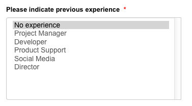
Similarly to the rows attribute, the size attribute can be used to specify the number of multi-select elements to display before scrolling becomes necessary.

Control-Inline
Syntax Example:
control-inline=true;Description:
The control-inline attribute transforms vertical lists of radio buttons and checkboxes into inline lists.

Custom-Type and Custom-Type-Group
Attribute Name:
custom-type
Syntax Example:
custom-type=url;Description:
The custom-type attribute defines a custom type for a Single-Line text field. See Form Custom Input Types for more information.
Attribute Name:
custom-type-group
Syntax Example:
custom-type-group=address;Description:
The custom-type-group specifies the use of a pre-defined group of user inputs such as fields necessary for address inputs. Please see Form Custom Type Groups for more information.
Dataset
Syntax Example:
dataset=state;Description:
The dataset attribute adds a predefined dataset to a radio button, checkbox, single-select, or multi-select element. This is useful for data that are frequently used, but tedious to type. For example, the “state” dataset includes all 50 United States so that they may be used in a selector element. Preconfigured datasets include:
- state
- state_ab
- country
- year
- month
- alphabet
- numbers
Datasets defined in another file may also be used. Provide the URL to the file as the argument and create the following file contents:
<dataset>first,second,third,fourth,fifth</dataset>When defining a dataset in the Advanced field for an element, the individual items do not have to be additionally defined as the data is pulled from the XSL or a separate file. For example, when defining a radio button element without the use of a dataset, the items are defined by clicking the New Radio Button and manually typing the text in the field. This holds true also for the checkbox, multi-select, and drop-down list items. No further definition is required with the form element creation when using a pre-defined dataset.
The following datasets can be used on:
- Radio Buttons
- Checkboxes
- Drop-Downs
- Multi-Select
| Name | Syntax Example | Description |
|---|---|---|
| country | |
All countries in alphabetical order. |
| state | |
All states in alphabetical order, excluding Washington D.C. |
| state_ab | |
All state abbreviations in alphabetical order, excluding Washington D.C. |
| month | |
All months in alphabetical order. |
| month_ab | |
All month abbreviations in alphabetical order. |
| year | |
All years between 2005 - 2025 in chronological order. |
| http://www.montana.edu/mysite/mydataset.xml | |
Datasets defined in another file may also be used. Provide the URL to the file as the argument and create the following file contents: |
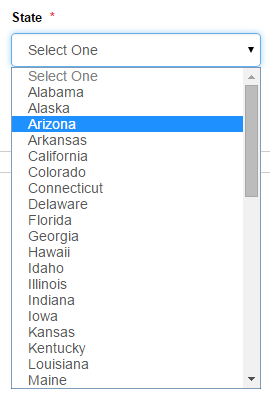
Here is an example of a Drop-Down menu using the state dataset.

Dataset for Montana Counties
(Thanks to MJ Nehasil!)
<dataset>Beaverhead,Big Horn,Blaine,Broadwater,Carbon,Carter, Cascade,Chouteau,Custer,Daniels,Dawson,Deer Lodge,Fallon,Fergus,Flathead,Gallatin,Garfield,Glacier,Golden Valley,Granite,Hill,Jefferson,Judith Basin,Lake,Lewis and Clark,Liberty,Lincoln,Madison,McCone,Meagher,Mineral,Missoula,Musselshell,Park,Petroleum,Phillips,Pondera,Powder River,Powell,Prairie,Ravalli,Richland,Roosevelt,Rosebud,Sanders,Sheridan,Silver Bow,Stillwater,Sweet Grass,Teton,Toole,Treasure,Valley,Wheatland,Wibaux,Yellowstone</dataset>
reCAPTCHA
Description:
We recently activated reCAPTCHA, a service that helps protect our forms from spam and abuse.
It is automatically enabled on forms. As a result, you do not need to manually add anything to any fields in order to get it to work.
Disabled
Syntax Example:
disabled=true;Description:
Disabled, as one would expect, specifies whether or not a given element is enabled or not. Here is an example of a required URL input field that is disabled.

Failure-Text
Syntax Example:
failure-text=Lorem Ipsum;Description:
Failure-text defines the text for a failed validation of the associated input if not already specified in the element's panel. For example, to avoid using the default error text for a required radio, checkbox, Drop-Down, or Multi-Select, set this value. It can be entered without quotes and can include spaces.
Note: To use the standard message instead, enter 'default' into this field.
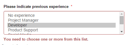
In the following example, a custom validation error is specified for a Multi-Select:

Min, Max, and Step Attributes
These attributes can be used in conjunction with custom-type=number; to create a number type input with the HTML5 step arrows and validation parameters.

Attribute Name:
max
Syntax Example:
max=100;Description:
The max attribute adds a maximum constraint for a custom-type=number; field.
Attribute Name:
min
Syntax Example:
min=10;Description:
The min attribute adds a minimum constraint for a custom-type=number; field.
Attribute Name:
step
Syntax Example:
step=10;Description:
The step attribute adds a step for the HTML5 up/down arrows for a custom-type=number; field.
Help-Text
Syntax Example:
help-text=This information will be used to create your corporate badge. Make sure it's accurate!;Description:
The help-text attribute adds light gray text beneath the associated input field to guide the user in filling it out.
In this example, a single-line text field element includes some helper text.
